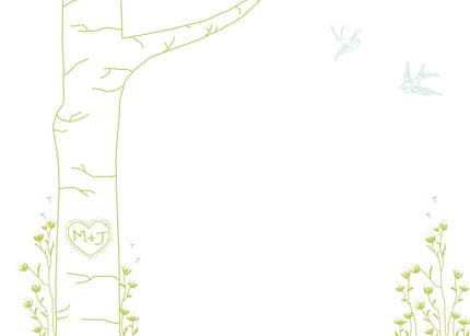
I love the whole look and feel of the print. I contacted Amanda to see if I could use her idea. She gave me her approval to copy the idea and share it with you all. Thank you so much Amanda for the inspiration!!
First thing I did was try to DRAW this. For those of you don't know me, I don't draw. I doodle but it's not something I would EVER show to anyone! So I drew it and was really surprised with myself!!
I made a few changes for mine, of course the initials and I also added a second tree branch with some little branches growing off those main branches.
Can you tell why I don't particularly like -- it's a little lame. =/ anyway, I had the same paint colors left over so I knew I would use those. This way I am using only supplies that I already had.
I painted over my original design. When I finished, I could still see (very clearly) the original design on the canvas under the paint. No good -- so I decided to create a texture on the canvas using a sponge 'brush'. MUCH better results.
Thanks again, Amanda, for the inspiration!!


6 comments:
That looks awesome! I love it!
Love it! I'm telling you - it's time to open that shop! :)
very cute idea. i'm liking it : )
Oh I saw that on their blog!! And how cute is your rendition?! I really like the texture on the canvas vs. a flat paint. Excellent job... yet again!
So pretty!!
Great job!! I'm impressed!
Post a Comment